Matt Landau
  • Founder, VRMB

Finca Victoria


Have you ever come across a product whose presentation is on point?

Whoever put together the photos, copywriting, design was "on their game" or "looking sharp" in that it subliminally sucked you in and persuaded you to buy?

Finca Victoria is a farmhouse style B&B on the small island of Vieques, Puerto Rico, and every vacation rental professional can take something away from their website: https://www.lafinca.com/

While browsing, I've outlined some questions to ask yourself about your listings or website (along with some inspiration from Finca Victoria):

Do We Show That We Cater To Special Interests?
Today's all-inclusive resort model is outdated because it's a catch-all and travelers have more specialized wants. The more specialized you can get (shout out to ROster ROster (golf), SScurlock SScurlock (farms), BobG BobG (eco), Jefferson Jefferson (movies)) the more those loyalists are attracted.
Ideas: Yoga, dog-friendly, ayurvedic vegan kitchen (not even really sure what this means but I'm sure ayurvedics do), permaculture

Do We Convey Our Values?
With companies like Airbnb in the crosshairs of communities around the world for their role in facilitating (and failing to take responsibility for) toxic actors, what does your upstanding vacation rental business actually stand for? How are you distancing yourself from bad Airbnb energy?
Ideas: Choose local causes to support, share principles you work by, explain your role in local community

Is Our Style Full Of Personality?
Most travelers choose vacation rentals because they want aspirational flavor not a generic space to sleep.
Ideas: Share your origin story how you came to be the host, reveal your "The Dream Team" of hosts, explain the influence of your location on the home

Are We Professional?
These days, booking a vacation rental is a crapshoot. Travelers want to know you running an actual business and treating this seriously.
Ideas: Proudly share milestones, badges of approval, press, and truly thoughtful FAQs, covid19 protocol front and center

Finca Victoria for me is the embodiment of Limited Edition: the creation of something unique that is not replicable -- that does not scale past what you choose.

I'd like to encourage anyone to jump in and share any other ideas from this magnificent model of hospitality!
 
Last edited:
Yes, Matt, I totally agree: by the end, I wanted to meet Silvia! I am working hard on my own NEW (first) website and realise I need to be more personal on "Our Story". I love how aspirational La Finca is (who doesn't respond to "your getaway awaits"?!). I LOVE that the whole team is featured. I love how they have a Gallery (since they have such a great Instagram account and the "Gallery" concept is a bit old-fashioned but they have made it relevant for social media). Absolutely Limited Edition.

One area that needs attention. The first thing I clicked on was "A note from La Finca about Covid 19: EXCITING NEWS" ....and the first sentence reads "We are so excited to share with you that we are reopening Finca Victoria this Friday, June 19th. " Two thoughts: first, I want exciting news about Covid because I am weary here in Italy after one year and second, YIKES. They are talking about 2020! If there is a message (about Covid or anything else), it is vital to keep it updated (because that makes me think they are not attentive to details).

Thanks for these ideas!
 
LaFinca is a spectacular destination! The pictures and description draw me in! Once onsite, I'd never want to leave (but I would, of course to see what else is on Vieques.) LaFinca certainly makes the best of its not-on-the-beach location. Spying on this property from Google Maps, there appears to plenty of competition in the hospitality space, so it's smart to provide as much as possible so that guests spend as much time and money at LaFinca.

Thanks @Matt for asking for my comments. I'm not sure that I measure up with these titans: RuthM RuthM ROster ROster Catherine Catherine BobG BobG and Jefferson Jefferson. My theme is Swedish-Kansas small town/rural, if I would hazard a guess. I'd be interested to hear what this group thinks that I offer thematically. After all this time, I'm still not crystal clear on how we stand out, other than our friendly, small-town professionalism.
In my opinion, you're the titan! You do a fabulous job with integrating with your community; you have managed to build loyalty among your cleaners and retain them! You are A+++ in marketing and promotions....your "Mojo" exudes hospitality and brand loyalty.
Bottom line: you are doing everything right. That's my pat on your back!👍🎈
 
Well done to https://www.lafinca.com/ - it is less a website and more a beautifully curated experience. I am so impressed with design and layout like this - I am able to recognize art when I see it, but if any of you are like me, I find it very hard to replicate.

I'd like to pick up on what Matt Landau Matt Landau mentioned towards the end of the post - professionalism and scaleability.

Professionalism is something that we all need to be increasingly concerned with. This time being our moment in the sun (as VR managers), we have a great opportunity to shift the whole notion of VR into the mainstream and make it a long term and sustainable alternative to hotels. While this is exciting, I think that there is also significant risk in this moment; if we don't do our part in elevating the professionalism, our moment in the sun could leave us getting a bad sun burn. The bad actors that Matt references are all over the place and while we VR Pros are hard at work making solid ground, often too quietly, the bad actors are loudly crashing the party. Let's use this as a reminder to do our part to increase professionalism by presenting ourselves as the strong small-business leaders that we are.

Scaleability is such a unique notion in this industry. On the one hand you have ultra-limited edition like La Finca and on the other you have Vacasa. One is soul without scale and the other is scale without soul. If we do our work as VR pros right, there is space for large and small operations (soul and scale?). I truly believe that if we find can all build to a basic level of foundational professionalism (otherwise known as "standards") that we can build to the scale that we each have an appetite for that will allow us to represent our local flavor in the way that best suits each of us. For some this will be 1 property, and for others this will be 10's or even 100's.

So long as there is a basic standard that can be expected by guests (professionalism), then guests will be free to explore and discover places like La Finca with assurance that they will have the basic elements covered. Then, increasingly VR's will continue to grow in popular acceptance (scale) and we can use our moment in the sun to grow and ripen rather than just get burned.
 
The photography is so great, love it.

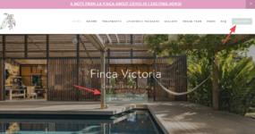
One thing I think that might be worth exploring on this site and perhaps others is the mobile layout.

On desktop the book now is pretty clear/direct:


On mobile you have to scroll quite a bit to get to those or click in the menu/hidden behind the "hamburger" -- would be ideal in my opinion to trim the text a bit more on mobile and maybe even include more "Learn More" buttons for each section too.
 

Attachments

  • 1614825660508.png
    1614825660508.png
    1.7 MB
  • 1614825661522.png
    1614825661522.png
    1.7 MB
What a fabulous place, right up my street.

Excellent presentation and design with the right tone IMO.

It reminds me very much of where I stayed in Puerto Rico 5 years ago. The Dreamcatcher has a similar holistic approach of style and a focus on health and well-being. Veggie/vegan food, yoga, carefully crafted rooms and public spaces, restrictions on children stays, superb press coverage etc.

The lesson for me is find your niche and work it hard and if you get it right you will have found a brilliant recipe for success. By their very nature niches don't work for everyone. All you need is a niche that is big enough to service your business. Display your values boldly and don't feel that you have to appeal to the masses.

 
I'm a bit obsessed at the moment with mobile-first, accessibility, stability and speed, Google user mantra and 2021/22 move to ensure continued best experience. So more is often less in terms of initial impact. Apparently, people read for 5.4 seconds on average and look at the header image for 5.6 seconds.
A great header photo, a transparent capture message, easing into the extra content, all on a phone (annoyingly).
For someone who spends a lot of time in this space, I have been testing out the likes of Wix these days and they are so much better than before. This site is Squarespace, which I don't find as elegant to use but they make life easier for sure.
Recommendations are great and local ones highlighted at the top on the header image can help, but never understand why a booking.com badge is used, its an invite to book on their site and lose direct traffic?
One thing that does drop traction is jumping to the third party booking site and I know how tough it can be to organise effectively and seamlessly.
Overall I love the effort that has gone into any small business and aligns itself unquely.
 
First - I would LOVE to stay here - the descriptions and photographs (mostly) just make me want to lean in! We want so much not to be a commodity but also to appeal to many. Like Jed says, 'professionalism AND scale', but how to achieve it? And Richard and Conrad are on point about mobile - the stats are pretty strong that our connected devices and the internet of things are growing so quickly I can hardly keep up! Thanks for sharing - let's all go!!
(in other news, Grammarly just told me internet is plural is/are)
 
I would like to throw in another website into the mix The Laurels B&B near a large theme park in the UK


Scrolling through it gives the FPG (Future Potential Guest) all the information they need.

https://www.lafinca.com/ << This is also beautiful Matt Landau Matt Landau and thanks for the tag

I agree with Christina Christina I WANT TO VISIT 😆
 
What a neat looking property! I love the use of people enjoying the property. From playing the guitar to the dog relaxing on the floor and yoga, really gives you an idea as to how you would interact on property.

My only thought about Special Interest - being dog friendly is great for those that want to bring a pet or dog, but what about people that are allergic? I didn't look hard enough, but was there information about what they do to clean for those guests? I think in this case though the positives for dog friendly outweighs the negatives. Just a thought that comes to mind.

Again, this website proves that images sell. You need high quality professional images, cell phones are better than years ago, but "real professional" photos are great!
 
Beautifully done! I definitely don't deserve the "titan" title but would love to contribute if I can. I think focusing on a niche allows you to move past "stays" and "reservations" mindset into the "experience" realm. I truly believe that the fastest growing segment of guests in our industry are millennials (https://www.airbnbcitizen.com/wp-content/uploads/2016/08/MillennialReport.pdf) and millennials are all about travel and culture. I think the most successful vacation rentals know their guest and why they are coming. They then make their home an immersive experience into their local culture. If you ask the adults that are standing in lines at Disney Land (for 3 hours for a ride that will last 30 seconds and give them no thrill) why they are there, they'll tell you its the "experience". That's what people are willing to pay a premium for.
 
It's a really pretty website, well laid out and well thought out in terms of the visitor and user experience.
Visually the photos are juicy and I want to gobble them up.

It is a Squarespace template but that's not necessarily a bad thing.

I would suggest that that they need to hire an SEO expert like ConradO ConradO to take their website to the next level.
I'm no expert but I found the following items in a quick glance that I would suggest they work on.

The title tags and anchor text and photo tags need improvement if they are using this website to attract clients.

Keywords are golden.... I wouldn't get too wordy when creating an accommodation website.
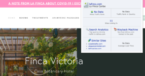
Right now using a free keyword tool they rank for 96 keywords.
Using fancy words like "Residency Packages" is not a clear SEO Content Keyword that will get traffic search results for hotel accommodations or a vacation rental business.

On the first "suite" page I didn't see any valuable titles or keywords like "room rates" "hotel rooms" "rental" "vacation" "vacation rental" anywhere.
They use keywords like "bookings and rates"... but I think they need to narrow down their keywords to better indicate to browsers what their business is.

Their press is impressive (Coastal Living) which I'm sure cost them close to $10K for the exposure, so I'm sure it's only a matter of time before they make an impact ranking-wise.
Right now there is no data on Alexa ranking.
🙁

Screen Shot 2021-03-08 at 1.15.45 PM.png

Using SpyFu for analysis their website traffic looks like it picked up a bit right at the same time as the Coastal Living article was released in Fall 2020.
Before that their traffic was really low around 500-800 per month.

It's a good lesson to show that it's not just a pretty website that you need to drive quality traffic to it.
You need great SEO Titles and Keyword Rich Content and Marketing as well.
 
It's a good lesson to show that it's not just a pretty website that you need to drive quality traffic to it.
You need great SEO Titles and Keyword Rich Content and Marketing as well.

Nancy, of course you're completely right! And what you are saying here is a class demonstration of the difference between a pro and everyone else.

😒🤔 Thanks for spoiling our fun! 😛🙄🤣
 
To perhaps take a hard right in this conversation, I would personally say that I don't think a website like this should invest any money in SEO or keyword rich content.

From a marketing perspective, I think this host is doing a number of things very right. Short, memorable content headings "Every room is a little universe", very beautiful/modern photography, visually appealing top-down layouts, selling the features/sections/amenities (pet friendly, communal areas, etc.).

The internet is primarily a visual medium - the host is doing a really good job at trying to take advantage of that.

I think any guidance to shape your copy/text-content towards SEO value is really the wrong strategy for this brand or any brand.

In my opinion, they need to do what is tried and true: delivering messaging that penetrates the mind of their ideal consumer. They need to focus on delivering the right content that causes a real human to connect their own dreams with what the host says they're offering. Then they need to make it as simple as possible to book them.

Trying to optimize for robots isn't going to help you do any of those things.

I know this is very against the grain, so please don't hear me trying to attack anyone's position. Many brilliant internet marketers out there would disagree with me here, so take what I say with a grain of salt.

I just really think the typical host will ask far better long-term minded questions about their company if they take Google off the table as a traffic source.

Far better would it be in my mind for the host to take all the time/effort/money they would invest in SEO and instead invest it in creating really cool, unique, one-of-a-kind experiences for the guests when they're actually experiencing the stay. That will produce far stronger near-bulletproof future revenue.

Optimizing for your rank on a Search Engine owned by a 3rd party that cares nothing about your brand and whose rules/algos change daily is a game of cat and mouse where you're never going to catch the mouse no matter how much time and money you invest.

I think Starship Landing has done a good job of doing really cool/unique things on a reasonable/meaningful budget that enhance the stay experience, and as a consequence, have really driven a ton of "free" marketing from past guests by taking advantage of influencer culture and the reality that the internet is primarily visual.

Starship has definitely still propped themselves up on a 3rd party channel, but I suppose the one benefit to choosing Instagram over Google in this case is that Instagram is built less on optimizing for search and optimizing for engagement with people who already follow you.

Not trying to stir the nest or anything, just feel like we've all been programmed to assume that SEO is the default orientation for marketing in 2021, and I just feel like there are alternate perspectives that will land us in very different business positions if we're willing to go against the grain.
 

About the author

Matt Landau
Founder, VRMB
Joined
Last seen

Thread statistics

Created
Matt Landau,
Last reply from
ToonTownRob,
Replies
20
Views
2,921
Back
Top